IMG 0135 2

Here’s one for you. This fall the art270 staff will have a freshman, a sophomore, a junior, and a senior in high school. Adding to that line up is a college freshman and a college sophomore, and a second year graduate student too. Fortunately for the parents, the kids are spread out among three families.

Why am I sharing these odd stats? Who better to have on your team than seasoned professional communicators that are right in the throws of the college admission process? We have a student that has moved through three different colleges on the path to grad school; we have a college sophomore working through the growing pains of settling on a major; we have a college freshman that has just experienced the recruiting and decision process; and we have four more students lining up in high school that are planning for college.

We’ve waded through the viewbooks and eblasts, and made the college visits. We’ve listened to the enrollment pitches and talked to the recruiters. We know what it takes to make your school stand out among the competition. We know education, and we know how to talk to students...because they’re our kids.

Want to talk more about what it takes to capture the interest of a college student? Call or email This email address is being protected from spambots. You need JavaScript enabled to view it. to find out what this team of seasoned college parents can do for your recruiting program.


icons

Today was one of those days. We all have them, but since I’m doing the writing, I get to tell my story first. I was attempting to download files from one of the many file sharing sites available on the web, and I couldn’t for the life of me figure out how to actually download anything. Now you’d think that a site made for a specific purpose should have the process wired, but alas, I was dumbfounded. Across the top of the webpage were a series of overly-simplified symbols that were supposed to guide me through the process—except I had no clue what these symbols were supposed to represent. In ancient cave paintings, a stick figure with a spear chasing a bison meant “hunting,” and if I'm walking through a public space, a set of symbols showing a simple man or woman figure means “toilet,” but what does a dot followed by a dash mean? Or how about two dots? Two dashes, anyone? Now if we were speaking in Morse Code I could tell you that a dot followed by a dash is the letter A, two dots is an I, and two dashes represent the letter M (yes, I was a Boy Scout)—but they were definitely not using Morse Code here.

In 1974, the U.S. Department of Transportation commissioned the American Institute of Graphic Arts to develop a series of international symbols. Fifty symbols were adopted, including many of the icons we’re familiar with today in airports and other public spaces. Common symbol sets have been developed for other purposes as well, and get this—we all know what they mean. Looking at the illegible symbols in this file sharing program got me thinking, why reinvent the doorknob every time we need to speak in shorthand?

As graphic designers, our number one job in life is to communicate—efficiently, effectively, and in the simplest manner possible. So with tongue firmly planted in my cheek, I present to you a set of symbols that should solve all of these problems (at least for English-speakers).

Of course no set of symbols is perfect. We’ve already recognized that these are only good if you can speak the language, but my point is this—Keep it Simple Stupid, a.k.a. the KISS principle. Good design doesn’t need to be reinvented with every new problem, and it certainly should not be complex. Tell your story in a direct and straightforward manner and I guarantee you’ll be happier with the returns.

Lost? Need help finding your way? Want to see a few examples of art270-designed wayfinding systems and infographics? Email This email address is being protected from spambots. You need JavaScript enabled to view it. and we'll send plenty to get you inspired.


50Years Poster 25x35

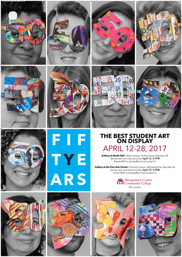
From April 12–28 Montgomery County Community College will hold it’s annual student art exhibition at the Blue Bell and Pottstown campuses. art270 was asked to design a poster to promote the fifty year anniversary of the event. The resulting poster was a “New Years Eve-style celebration” featuring current graphic design students. The students were handed a paper diagram for a set of glasses made from the number 50, and asked to add their own personal artistic touches. Considering they were given just a few minutes to complete the task, the resulting photos of the students donning their masks are lots of fun, adding a colorful and playful twist to the poster. If you are in the area, be sure to stop by and enjoy the work of these young and aspiring artists. You won’t be disappointed.

art270 founders Dianne and Carl Mill teach at Montgomery County Community College. Dianne is on the full-time art/design faculty, and Carl guest lectures. Photography of the students was provided by John Welsh.

Have an event on the horizon that needs promoting? Want to see more art270 poster and event collateral design? Email This email address is being protected from spambots. You need JavaScript enabled to view it. and we’ll send you more fun project samples.


Steve 300aFor those of you who know Steve Kuttruff, you will remember him as a talented and focused artist—and a good friend. During his thirteen-year stay at art270, he worked as a senior graphic designer, managing a broad range of communications projects that included business identity and branding, annual reports, periodicals, and marketing collateral of all kinds. Steve will always be known for putting a little extra spin on every design solution—and for creating the current art270 logo that we’ve put to good use for more than 13 years. We are thrilled to announce that Steve will be rejoining art270 in sales, marketing, and a design and planning role. We’re looking forward to having his humor and smile back on the team.
Steve graduated from Penn State University with a BA in graphic design in 1989 and began working at art270 in 1990. In 2003, Steve returned to school full-time to earn his degree in special education. While teaching at the elementary school level he also began coaching a sport that he grew up with—diving. With the success of his coaching, Steve moved on from the classroom to the pool and has been the diving coach at La Salle University since 2007. Steve has developed state champions, USA Diving national finalists and Olympic Trials qualifiers.

Give Steve a call or send him an This email address is being protected from spambots. You need JavaScript enabled to view it. to say hello, or if you don’t already have an art270 contact, give him a call to arrange a meeting to discuss your next project. He is looking forward to getting to know you, and how art270 can serve you best.


logos 270

This week I had an opportunity to teach a graphic design class at a local college. As you know, I spent about 10 years on the staff at Temple University’s Tyler School of Art, thus getting back in the classroom is always a treat for me. The subject for this class was logo design, so a good portion of my lecture focused on what makes a good logo. Since the points we reviewed are fresh in my mind, I thought I would share them with you. See if your company logo passes this test. Successful logos should meet, at a minimum, these six criteria:

1. Simplicity: Is your logo streamlined and pared down to only the most important components? Overly complex logos just become visual clutter.

2. Memorable: Is your logo distinct among your competition? Does it leave an impression?

3. Versatile: Does your logo work in a variety of media? Will it work large and small and read clearly in all applications?

4. Appropriate: Does your logo work for your industry without being cliché or obvious?

5. Targeted: Is your logo appropriate for your audience?

6. Timeless: Don’t be trendy. Aim for longevity.

art270 has designed and developed logos and identity systems for more than a hundred businesses, organizations and events. A few that you might bump into in your travels include Montgomery County Community College, Brandywine Realty Trust, William Penn Foundation, Bartol Foundation and Philadelphia Futures.

— Carl


DSC 0016 b

It’s 2017, the beginning of a new year and new resolutions. It seems fitting that just this week we revised, printed and delivered an updated map for Hopewell Big Woods, with promises of new places to visit and explore for 2017. For those of you that have been following this newsletter for a while you’ll recall that Hopewell Big Woods is 72,000 contiguous acres that surround Hopewell Furnace National Historic Site and French Creek State Park, about an hour west of Philadelphia. Many moons, and quite a few hikes ago, art270 created a map for Natural Lands Trust to identify this Pennsylvania jewel of woodlands, streams and miles of walking paths. When we first sketched the borders of this vast area, my interest was peaked to explore the trails. I resolved to hike the entire 140-mile length of the Horse Shoe Trail which crosses the Big Woods on a meandering route between Valley Forge Park and the Appalachian Trail west of Hershey, PA. I’ve almost completed my adventure with just a few miles left, enjoying every bit of the adventure as the trail zigged and zagged through game lands, small towns, county parks, historic sites, and old and new farm roads. My resolution for 2017 is to finish the trail and look for new paths to follow. I’ve already started to plan to hike the Pennsylvania section of the Appalachian Trail, a trip I started years ago, and return to the Loyalsock Trail that follows the Loyalsock River in northern Pennsylvania, one of the most picturesque trails in the eastern United States.

What new adventures await you in 2017? A walk on the Schuylkill River Trail all the way to Manayunk via Wissahickon Park and Forbidden Drive? A long walk on a beach at least once a week? A strolling, unmapped tour of a city in Europe or the Far East? Or just a plan to get out, walk more often and simply enjoy the fresh air and exercise? Want to compare and share favorite hikes here, there and everywhere? Want to map out your design goals for 2017? Call or write me, 215-885-2756, This email address is being protected from spambots. You need JavaScript enabled to view it.. There is nothing I’d like to talk about more than planning for a new adventure in whatever form it takes.

— Carl

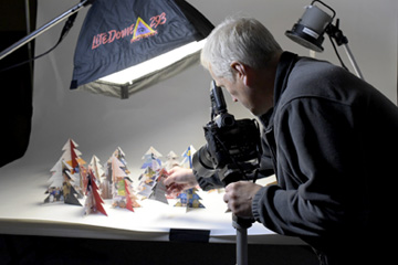
IMG 3176The holidays are supposed to be a time to relax, enjoy the quiet and de-stress. With all of the preparation for the “big guy” we all know that's not the case, until maybe about 3pm on Christmas day when the gifts have been opened, the roast is in the oven, and my family is all settled in for an afternoon nap.

In our design studio the rush to greet Santa on time is no different. Projects seem to roar in from out of the blue and there’s a sense of urgency to put the last project under the tree before leaving for the holiday break. (Now I know how Santa must feel around the old workshop every December!) This year, one of our favorite print suppliers asked us to create a holiday card for them. For a printer, purchasing a pre-made holiday card is akin to your favorite baker bringing a supermarket pie to the holiday dinner. So what to make for a business that specializes in printing beautiful cards and publications all day long?

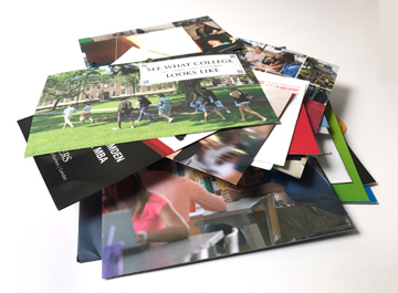
The concept was right before our noses in the piles of paper trimmings and printed samples adorning every surface of their print shop like an avalanche obliterating a ski slope. How about we create a card using these samples? And since the printed pieces represent their clients, the card will then become not only a greeting, but a subtle reflection of their clients, and a “thank you” as well.

A little snip here and a critical cut there, a little folding and joining, a pile of “snow dust” from the hole punching machine, and then a little creative photography—and wallah!—an instant wintery forest scene, complete with pre-decorated trees. The last time we had this many paper clippings hit the floor was when we cut snowflakes the size of hula hoops for one of our own cards.

Given the stress the holidays can bring, we wish you peace—and here’s hoping the new year will be packed with creativity and a little bit of pixie dust for everyone.

IIRPHere's a mouthful for you — International Institute for Restorative Practices. Exactly 45 letters, not counting word spaces. Imagine the logo conversations around the conference table when art270 agreed to take on this Bethlehem, PA, graduate school when they came looking for a re-brand. It couldn't have been something simple like Apple or Target or Nike, no, it was so long that we immediately made a note to never create a text template with narrow columns or we'd never see the name on one line again. The name length issue was pretty quickly resolved when we settled on the much simpler acronym IIRP for most brand applications. After all, everyone associated with this institution had already resorted to IIRP as the go-to shorthand solution.

Once that was out of the way, art270 went on to create a simple and clean logotype, all lowercase for impact, and a brand standards manual that identified approved typefaces, color palettes, page templates and logo extensions.

The crown jewel of the brand makeover was a website built from scratch using the Joomla content management system. The extensive new responsive website features include a custom student/faculty login with highly-detailed user access control, event registration integration, blog, and interactive maps.

It was a great project that required a high degree of client-vendor cooperation that allowed art270 to properly build a scalable user experience, and we even learned what restorative practices is. If you're curious, you'll just have to visit the new website, then give us a call to refresh your tired brand and website.

OvertonesFallFor just short of 30 years, art270 has designed and produced Overtones magazine for the Curtis Institute of Music — Philadelphia’s gift to the music world. In an era of digital news, Overtones is a testament to the beauty and viability of print. With more than 40 pages of beautiful photographs and engaging, well-written stories, this biannual magazine for Curtis alumni, students, families, staff and donors has grown from a simple two-color, self-cover, 8-page newsletter into a coffee table-destined “viewbook” on life behind the walls at Curtis. If you don’t know the Curtis Institute of Music, then you don’t know Philadelphia. Discover this vibrant world-renowned institution.To see more of this beautiful publication click here.

Step Up to College Guide 2016 1This time every year Philadelphia Futures, with design and production help from art270, publishes Step Up to College, a college planning guide for Philadelphia’s high school students. art270 has worked with Philadelphia Futures for more than 15 years producing these comprehensive guidebooks that have grown from a simple two-color document into a full color magazine-like presentation that can’t be matched for the information it provides to Philadelphia high school students. Kudos to Philadelphia Futures and their Executive Director and Mentor-in-Chief, Joan Mazzotti for another outstanding resource for Philadelphia's youth. To look at the guide in detail click here.

A little glimpse of heaven

2016 marks the 100th anniversary of the National Park Service. If you haven’t had an opportunity to visit one or more of our Country’s most awe-inspiring places, I’d suggest that you get it on your bucket list. Recently, I had one of those once-in-a-lifetime experiences driving with my son Ryan in his ’99 Dodge pickup 2,956.3 miles from Carversville, Pennsylvania to Reno, Nevada where he was headed for college. There are lots of stories from the trip (fortunately the truck made it without a breakdown), but one that stands out was a visit we made to Rocky Mountain National Park along the way. I had been to the Park twice before, 18 and 30 years ago, so what amazed me was that nothing had changed. It was like a time warp. No commercialization had taken over, no new roads had been cut, no hotels had sprouted. The Park looked just the way I remembered it with beautiful mountain vistas, tall trees, and wild elk and mountain goats wandering free. I was thrilled to share it with my 18-year-old son.

That’s what our National Parks are all about, preserving those wild special places so that we will be able to share them with generations to come. I’ve now checked dozens of National Parks and Monuments off of my bucket list including Zion, Capitol Reef, Bryce Canyon, Glacier, Yellowstone, Grand Canyon, Crater Lake, Redwood Forest, and locally Independence National Park, and Gettysburg to name a few. I can’t wait to explore Yosemite in California and Denali in Alaska someday.

A while back art270 created a series of birding guidebooks for New Jersey Audubon followed by road signs for the New Jersey Department of Transportation to identify some of the many scenic byways to be traveled around the State. I was just told by a little bird (or for you non-birding types, it was actually a tufted titmouse) that the Delaware Bayshore Scenic Byway signs are now being installed. How many of these signs have you spotted in your travels through New Jersey? If you send us an Instagram(art270inc), a Tweet(@art270) or simply an image of you standing next to a New Jersey Byways sign, we’ll post the collection on our website and Facebook page and send you a gift card for Rita’s Italian Ice to help extend your summer a bit longer.

bayshoretest

gamesEveryone is a collector of something, and I’m willing to bet that you have a collection of some sort. It may not be a formal, organized collection, but I know you collect something. It might be shoes or golf clubs, or postcards or beer coasters. Maybe it’s a collection of Pink Floyd concert tickets that you inherited. Whatever your collection might be, you have more than one of something because you get a smile out of it. Let me introduce you to one of my design-inspired collections.

I have about 70 bagatelle games hanging in my home and office. “Bagatelle” in this instance is the original name that was used to describe laptop games that required a ball or marble to be rolled into a hole in a game board. The bagatelles in my collection evolved from a tabletop game that had wooden pegs set up to “defend” the holes. These wooden pegs later were replaced by metal nails, and eventually the boards included spinners, pockets, ramps and other elaborate obstacles. Over time, these games evolved into bar billiards, Pachinko games and pinball.

Today’s electronic games take the tactile contact out of playing the game which is why I enjoy collecting these works of art from the past century. The graphics that were created all over the world are a daily inspiration, and visitors to my office can’t help but try their hand at one of the many games hanging on my wall. My favorites are the wood models, some made up entirely of hand-driven nails and painted with a brush. I also have one that made the boat trip to America from Russia. The images of animals painted on the surface have that look from another land. See the image above with the woodland animals.

If you enjoy vintage comic books, folk art or anything retro-Americana, you will appreciate these games from years past. If you want a challenge, stop by and try your hand at "Frenzy." I have yet to solve this rolling marble game of hand-eye coordination and I've been trying for more than 25 years!

–Carl Mill, President, art270

get our newsletter


Listed on AgencyList.org - Philadelphia Web Design Companies.   

Search