2020
 

More about 2’s and 0’s. The glyph used in the modern Western world to represent the number 2 traces its roots back to the Indic Brahmic script, where "2" was written as two horizontal lines. The modern Chinese and Japanese languages still use this method. The Gupta script rotated the two lines 45 degrees, making them diagonal. The number 0, or simply zero, most likely derived its shape from the sun and the moon. Many have ascribed divine qualities to circles. The study of the circle eventually led to the development of astronomy, geometry and calculus. The first evidence we have of zero is from the Sumerian culture in Mesopotamia, some 5,000 years ago. There, a slanted double wedge was inserted between cuneiform symbols for numbers, written positionally, to indicate the absence of a number in a place (as we would write 102, the '0' indicating no digit in the tens column). 

Call Dana to get us started on your next graphic design project or to see samples of our latest work. 215-885-2756.


2020
 

Think a custom logo, clever copy or a really cool 2020 will help to promote your business or next event? How about a new website, brochure or a brand refresh? Give us a call so we can talk it over. I don’t have to remind you that one good, well-designed image is worth a thousand words.

Contact Dana to get started on your next graphic design project, 215-885-2756.


2020
 

The number 0 is a whole number as well as an even one, especially for money, and is thus considered a lucky digit. 2 (两), pronounced er or liang, is considered to be lucky as the Chinese believe that all good things come in pairs. Will 2020 be a lucky year for your business? Will your brand, marketing materials and website help you to grow and prosper? If you’re wavering on your answer, it might be time to let us give it all a good look. We’ll be frank and honest, and if we think we can offer improvements we’ll let you know. If we think you’re on track to be the next Apple or Nike, we’ll let you know that too. All you have to do is ask.

Contact Dana to tell us your story. (She’s a good listener.) 215-885-2756.


2020
 

For the year 2020, the main zodiac element is metal, and the animal sign is Rat, and hence, 2020 will be the Year of the Metal Rat. The Chinese year will last from January 25, 2020 to February 11, 2021. Does your brand look a little “ratty?” Time for a refresh, an update or a brand new look?

Contact Dana to discuss how art270 can re-make your brand to get you noticed, 215-885-2756.


2020


Type comes in all shapes and styles, and with a little clever manipulation or arranging it can be shaped into a memorable logo. How well is your brand working in 2020? Is your logo or logotype interesting and memorable? Are you proud to promote your business with it? Do your employees feel the same way? Let’s talk about how your logo and brand can find new life and make the impression you had always hoped for this year.

Call Dana to discuss your branding or to see samples of our latest work, 215-885-2756.


2020
 

Think a custom logo, clever copy or a really cool 2020 will help to promote your business or next event? How about a new website, brochure or a brand refresh? Give us a call so we can talk it over. I don’t have to remind you that one good, well-designed image is worth a thousand words.

Call Dana to get us started on your project or to see samples of our latest work, 215-885-2756.


2020
 

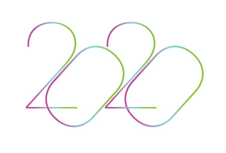
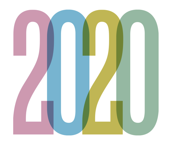
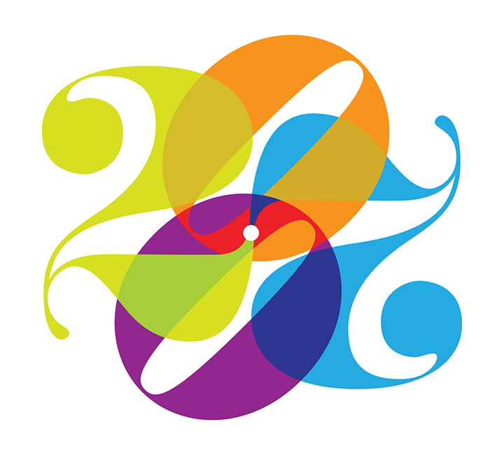
It’s 2020! Maybe that’s not a big deal to you, but for us graphic designers that get our kicks out of subtle details, having a number that repeats itself is a rare treat. You probably never gave it a thought, but the last time the date repeated itself was at the end of the first world war. Just for fun, we’ve created “twenty, twenty-twentys” for 2020 (beginning today on the 20th) to give us a jumpstart on invites, reports and such for this once in a lifetime year. Watch your Instagram, facebook, Twitter or email accounts for the daily 2020. And if you have a good idea for your own 2020, we’d love to hear from you.

Think a custom logo, clever copy or a really cool 2020 will help to promote your business or next event? How about a new website, brochure or a brand refresh? Give us a call so we can talk it over. I don’t have to remind you that one good, well-designed image is worth a thousand words.

Call Dana to get us started on your project or to see samples of our latest work, 215-885-2756.


Posters test
 

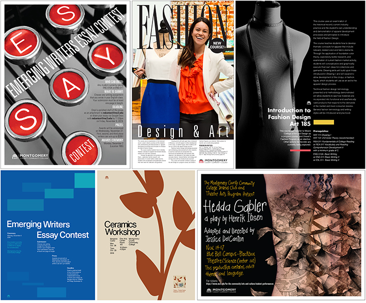
October was a busy month at art270 for poster design. Every fall and spring, our client, Montgomery County Community College, needs to promote a variety of campus events and programs and art270 gets the call to deliver the graphics.

Posters work well as an advertising medium in the college environment because students, faculty and visitors tend to move around by foot all day long making them good candidates to view the large poster graphics placed at strategic locations. Unlike online advertising which tends to become nothing more than passing visual noise, posters remain stationary for a period of time which means that viewers will see them over and over during the course of their day cementing the message. 

The posters shown here were developed by several art270 designers, and our new intern, Kyle Valdes, a Montgomery County Community College graduate and currently a student at University of the Arts, using a team approach to the project. The events include a theatre production, a writer’s competition, a pottery exhibition and a new fashion course being offered by the college. We love working on poster design, because solutions are typically an exercise in simplicity, or “less is more,” a phrase often associated with the architect and furniture designer Ludwig Mies Van Der Rohe (1886-1969), one of the founders of modern architecture and a proponent of simplicity of style. When we design a poster, our goal is to add all of the components we think will tell the story and convey the idea, then carefully remove elements until we can’t take away any more without changing or confusing the message. Typically a finished poster should have no more than three distinct elements. This can include the main image (photo or illustration) the headline, the body copy, the logo, and more. It’s the “more” that we are always trying to eliminate to make the message clear and concise. 

Want to read more about the history of poster design? Here is an article that will give you a brief overview of how and when posters developed around the world. 

Think a poster (in print or online) will help to promote your next event or convey your message? Give us a call so we can talk it over. I don’t have to remind you that one, good, well-designed image is worth a thousand words (or emails).

Call Dana to get us started on your project or to see samples of our latest poster work. 215-885-2756, This email address is being protected from spambots. You need JavaScript enabled to view it.


poster
 

The Future is Bright!


As a graphic design company, art270 works every day with amazing people and organizations. Our relationship with Philadelphia Futures and White-Williams Scholars started over twenty years ago, but this unique non-profit has continued to wow us with great work and the dedication they show for Philadelphia high school students 365 days a year.

Founded in 1989, Philadelphia Futures has made a profound difference in the lives of thousands of students through the power of education. White-Williams Scholars, dating back to 1800, had a long and highly regarded reputation of providing low-income students with the financial resources necessary to support their academic goals in high school. The two organizations joined with the intention of combining resources and assets in the pursuit of a common purpose – to provide low-income, first-generation-to-college students with the tools, resources, and opportunities necessary for getting accepted to, and success in college. 

Here are a few amazing facts and figures to ponder:  
The Class of 2019 by the Numbers 
• 100% of our 89 seniors are on track to graduate from high school and have been accepted to college. 
• 43% applied to college via Early Decision, a process that optimizes their opportunity for financial aid. 
• 81% of students earned a cumulative GPA of 3.5 or better. 

Philadelphia Futures Scholars by the Numbers
• 11%, national average, college graduation rate of first-generation students; 70% or above, Futures’ potential college graduation rate, in classes since 2010. 
• 285 high school students are enrolled in the program this year. 
• 350 Futures collegians are enrolled at more than 50 colleges and universities across the country. 
• 51% of our collegians are attending partner colleges, receiving $4.9 million in institutional aid. 
…and 42,000 copies of (art270-designed) Step Up to College Guide were distributed to 102 public, public charter, and parochial high schools, 54 libraries, and 90 community-based organizations and government offices throughout Philadelphia. 

art270 has designed and produced publications, reports, websites, newsletters, invitations, and programs that, by now, number in the hundreds, including the Philadelphia Futures identity. Like the Philadelphia Futures program itself, our relationship has been about consistency and dedicated service. If you know of a high school student that is looking for a little, or a lot of help with the college admission process, watch for the newest edition of the Step-Up-to-College Guide coming this fall. 

To learn more about this amazing organization visit their site.

Does your company have an important message you need to deliver? Call or write Dana Breslin at 215-885-2756, This email address is being protected from spambots. You need JavaScript enabled to view it..


EN combo 360
 

Our National Parks, right here in our backyard!


As a graphic design company we are constantly being introduced to amazing people and the work that they do every day. This is the fourth in a series of our monthly newsletters where we’ll introduce you to some of these companies and organizations. We think you’ll find their stories intriguing.

With headquarters in Fort Washington, Pennsylvania, Eastern National operates park stores in more than 150 National Park Service locations, across 34 states, the District of Columbia, Puerto Rico, and the United States Virgin Islands. Each store is a reflection and an extension of the interpretive themes of its location, making each store unique. Eastern National works with more than 5,000 vendors to supply their stores with educational products that enhance visitor experiences, and develop custom merchandise that is specific to the sites they serve.

Producing up to 100 custom publications per year, Eastern National produces high-quality products that are extensions of the sites’ educational and interpretive programs. They allow visitors to expand on the knowledge they gained while visiting, provide an in-depth look at a site’s theme or purpose, and help visitors take their experiences home with them. In short, Eastern National is responsible for all of the cool stuff you find in National Parks’ stores.

art270 has partnered with Eastern National for over thirty years to create short histories on civil war battles and campaigns, the revolutionary war, famous Americans, and more. We also worked with Eastern National to develop their popular Passport to Your National Parks book series, and most recently a Junior Ranger edition for children.

To learn more about this amazing organization visit their site.

Does your company have an important message you need to deliver? Call or write Dana Breslin at 215-885-2756, This email address is being protected from spambots. You need JavaScript enabled to view it..


52 POSTER lttr
 

52!

For the past three years art270 has created the poster and promotional graphics for the Montgomery County Community College annual student show. 2019 marked the 52nd consecutive show. 

So what to do for a strong visual design? Recognizing immediately that the 5 and 2 have similar typographic characteristics when flipped, the team found an interesting typeface rendered in 3D, then boldly colored the letterforms to create a strong, colorful graphic design for the show poster. The simple colored planes are eye catching, and subliminally represent the many different works of art that visitors will experience at the show. 

Need a fun and dynamic design for a poster, mailer or eblast for your next event? Call Dana to get us started on your project or to see samples of our latest poster work. 215-885-2756, This email address is being protected from spambots. You need JavaScript enabled to view it.
 

get our newsletter


Listed on AgencyList.org - Philadelphia Web Design Companies.   

Search